My Deliverables:
Design System, Application of Design System
Project Summary
Personal Project: Establishing a basic design system with key UIUX considerations and scaling a product to include a new product offering.
Personal Project:
Design System For Carousell
Background
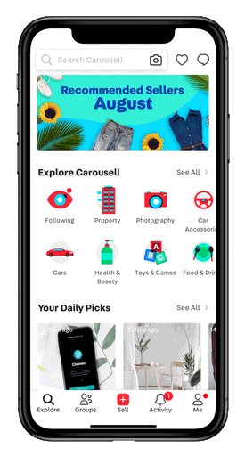
Carousell, operating in Singapore, Hong Kong, Indonesia, Malaysia, the Philippines, and Taiwan, is a classifieds and recommerce marketplace. It simplifies the selling process through easy photo uploads and facilitates buying through straightforward chat interactions. The platform features a diverse array of products spanning various categories such as cars, lifestyle items, gadgets, and fashion accessories.
Introduction
Design System Workflows
An overview of the design system workflow for UI Designers:
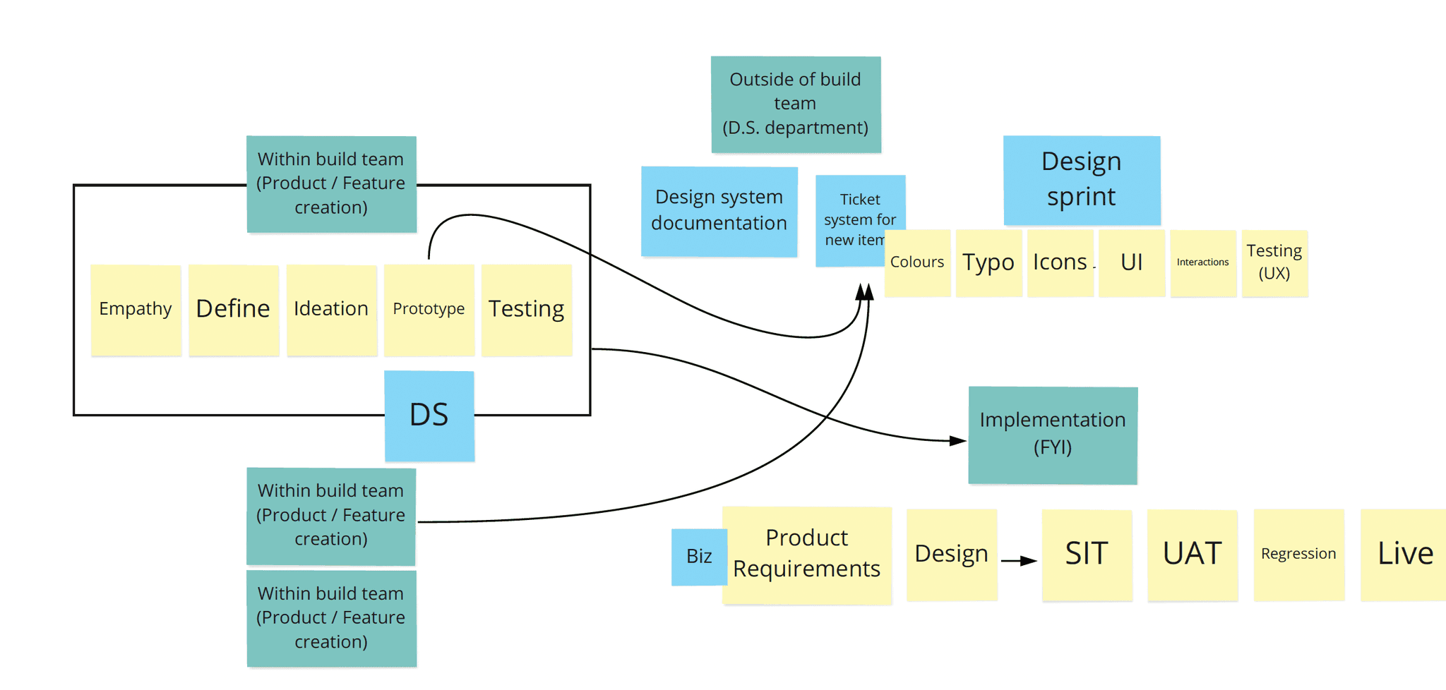
In groups of 4 members, we selected Carousell to work on by creating a fundamental design system. This system aims to enhance consistency, clarity, and quality in the design process, benefiting designers, developers, and the overall product team.
The Challenge
Problems
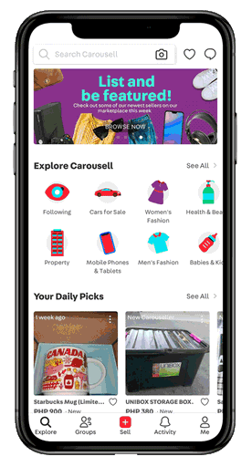
Before embarking on the development of design systems, we analysed the current app design, categorising common issues encountered with its UI design.
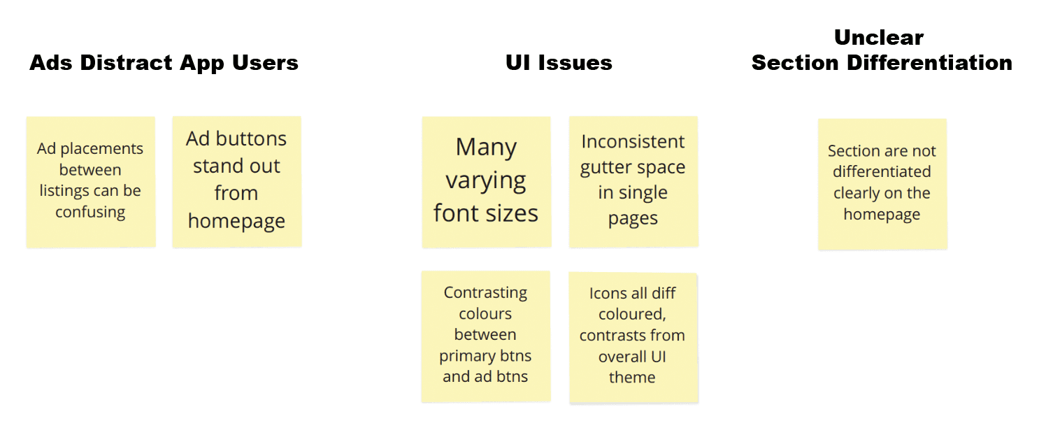
Why are inconsistencies in spacing and fonts problematic?
This presents an issue according to Gestalt Principles in psychology, which advocate grouping related information together. Our goal is to prevent new users from perceiving the app as disorganized and dissuade them from usage.
Core Guidelines
Key Design Principles
Design Principles help us with decision making. A few simple principles or constructive questions will guide our team towards making appropriate decisions.
As a team, we listed the purpose of using Carousell, the design principles needed and prioritise them using Maslow's Hierarchy of Law.
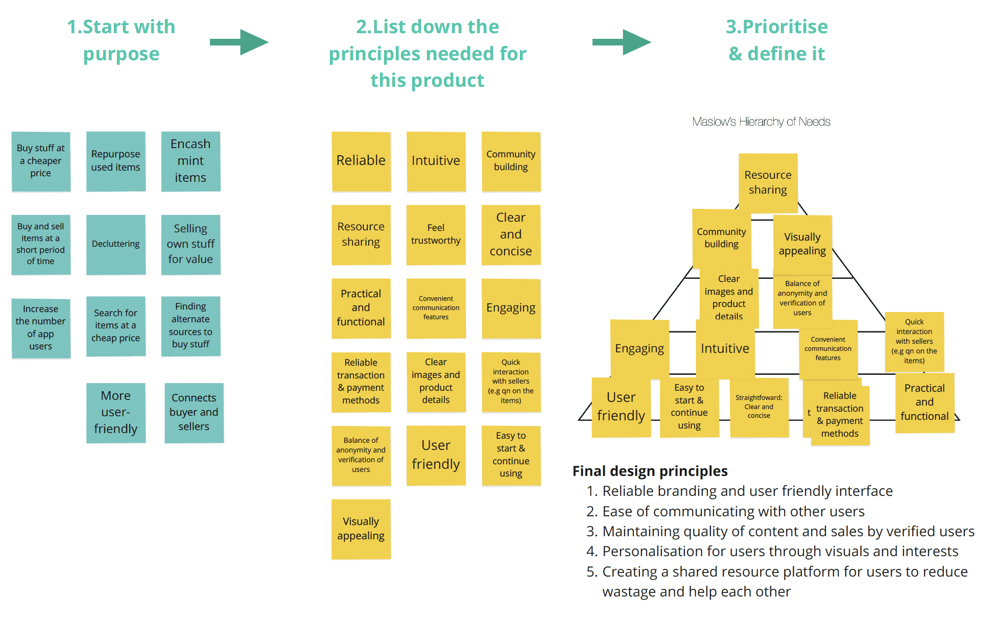
For this case study, we adhere to the design principles that we have agreed upon as a team:
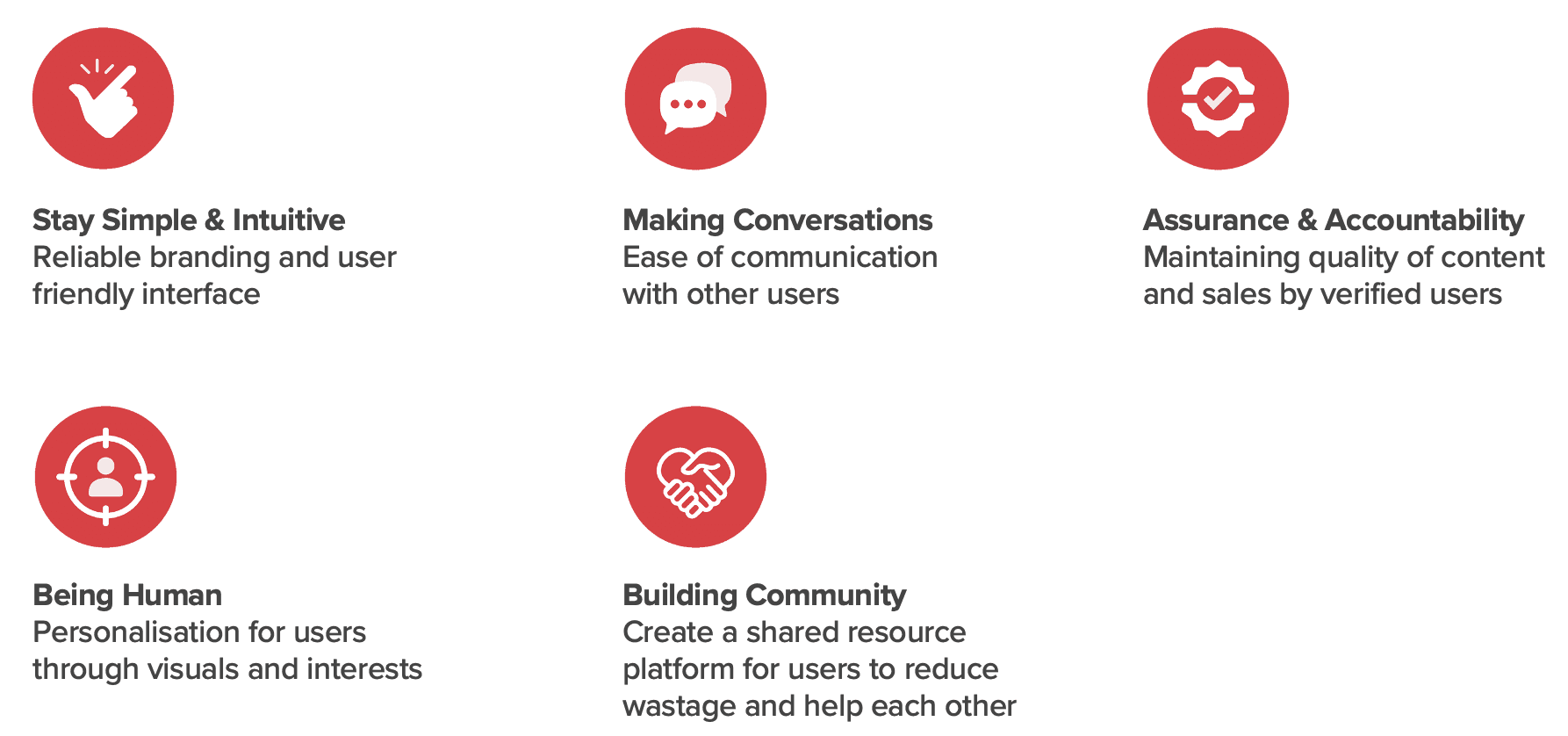
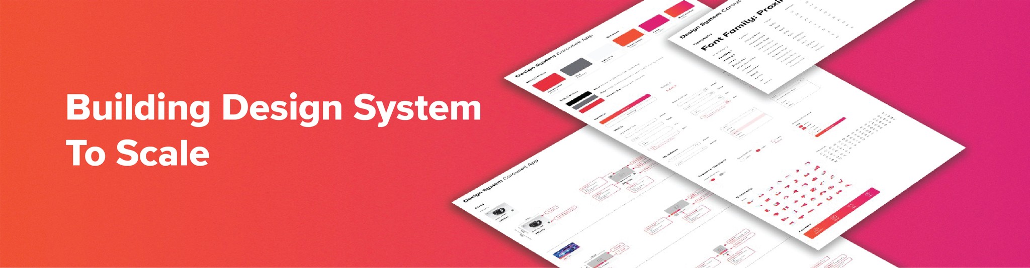
Emphasising agreed-upon design principles, we focused on defining UI fundamentals, including font, colors, and illustrations. From there, we established a key component, blocks, and design patterns applicable across various parts of the product or suite.
UI Foundations
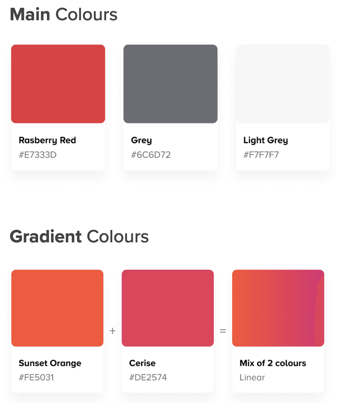
Colours
We retained their corporate red colour and introduced gradients for vibrancy, elevating the functional app to a visually appealing experience.
Main colours - used for CTA buttons
Gradient colours - used for ribbons elements, navigation bar
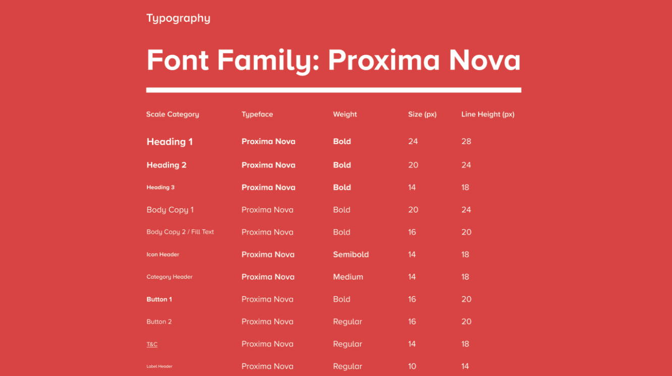
Typography
The use of Proxima Nova for this app design is due to its clean and modern aesthetic, excellent readability in various sizes, and versatile weights and styles.
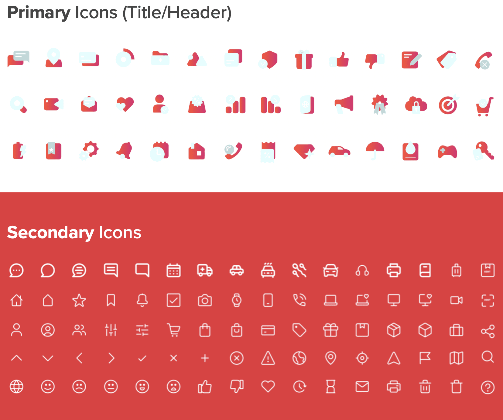
Icons
Primary icons are categorised separately from functional icons (secondary icons) to distinguish their significance. Given the app's numerous features, this distinction helps clarify and differentiate the varied functions performed by these icons.
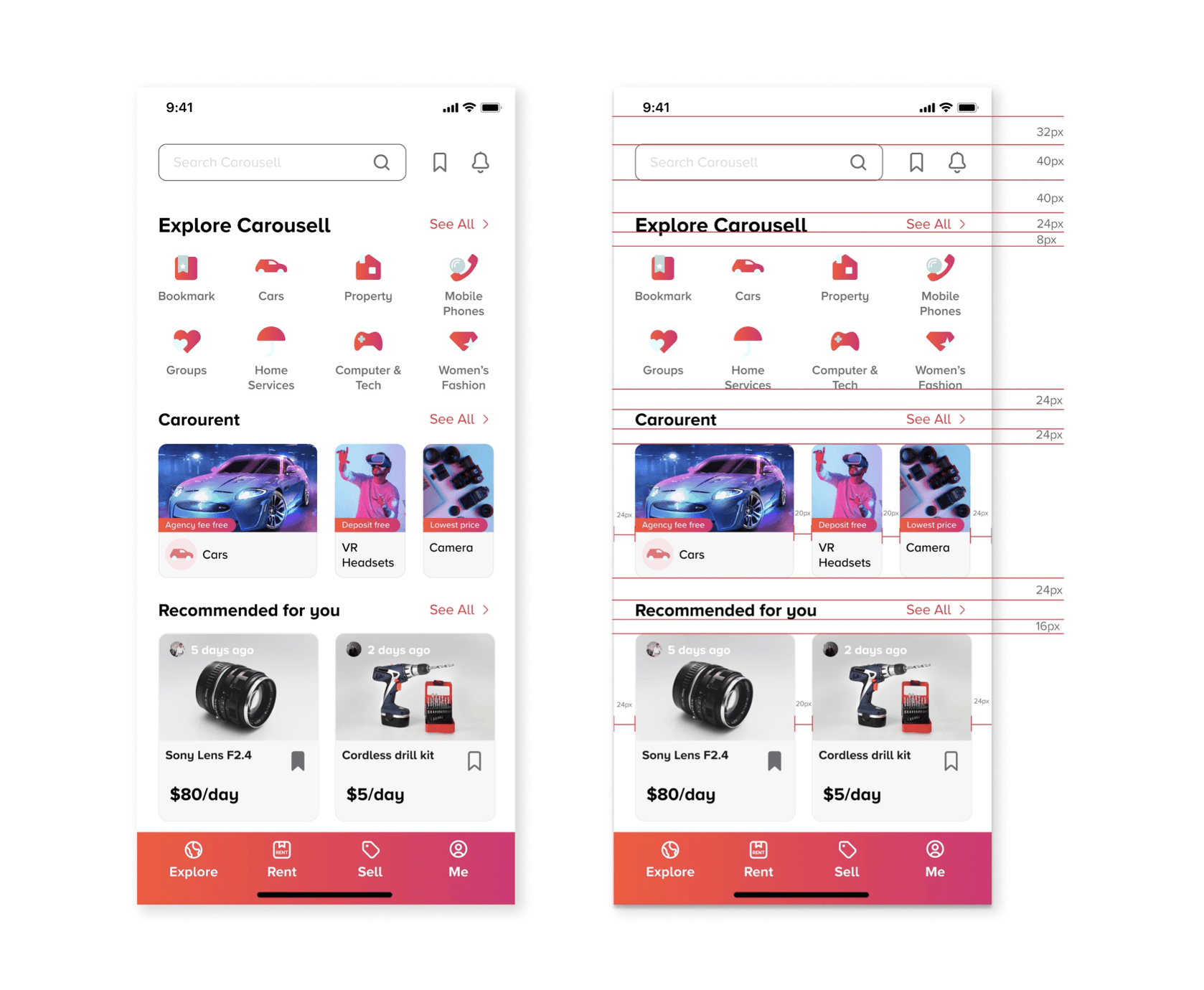
Grid System
All spacing for components and typography is done in increments of 8 pixels. This forms the basic unit of measurement for spacing and ensure spacing consistency
Other elements
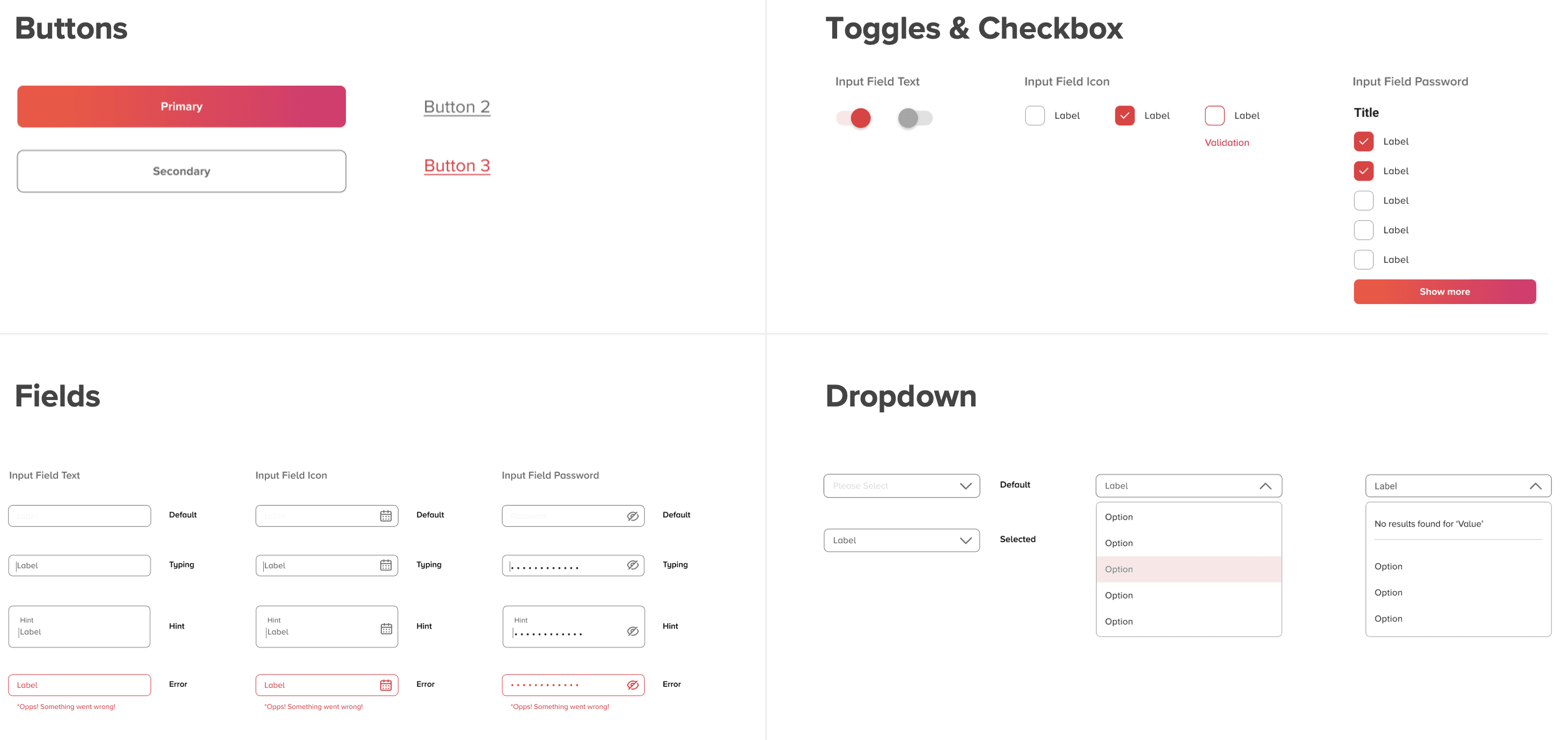
We opted for a straightforward button design, maintaining a single primary button on each page for enhanced accessibility. Consistent designs were applied to text fields, toggles, checkboxes, and dropdown menus across the interface.
UI Foundations
Prioritised Revised Components
Revamped consists of:
● Use of new icons
● Use of new product card system
● Use of updated colour scheme
● Updated use of grid system
Components
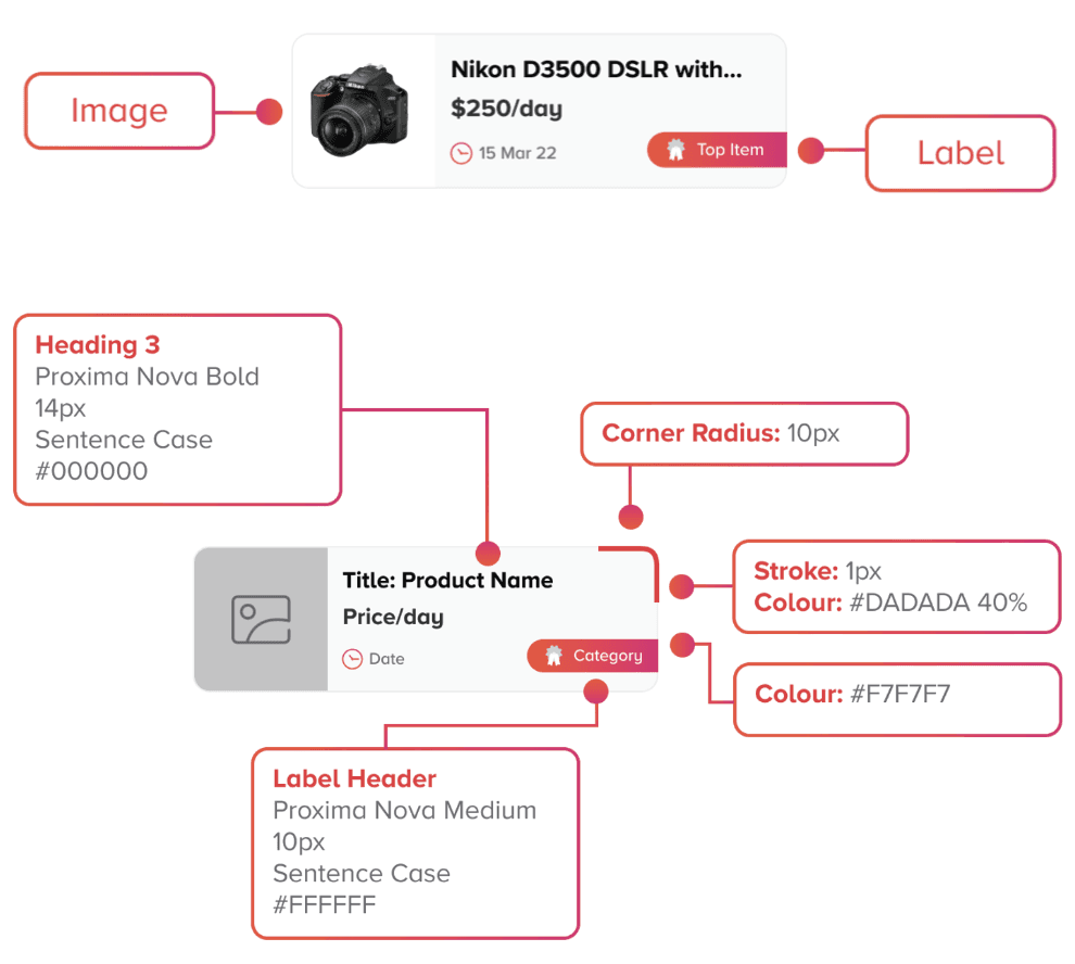
We have specify typography styles (fonts, sizes, weights), colour schemes, consistent spacing, margins, and layout rules to maintain visual harmony and readability across components.
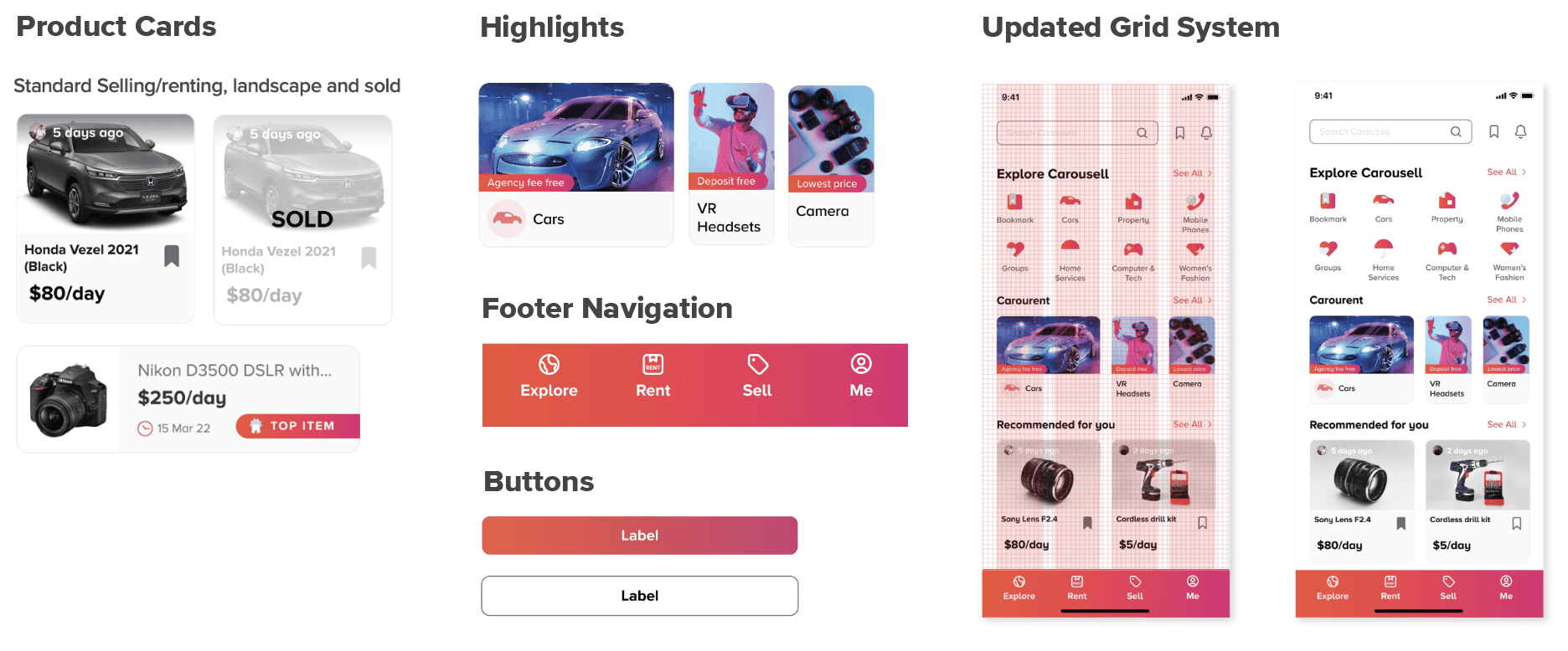
Primary Card - Portrait
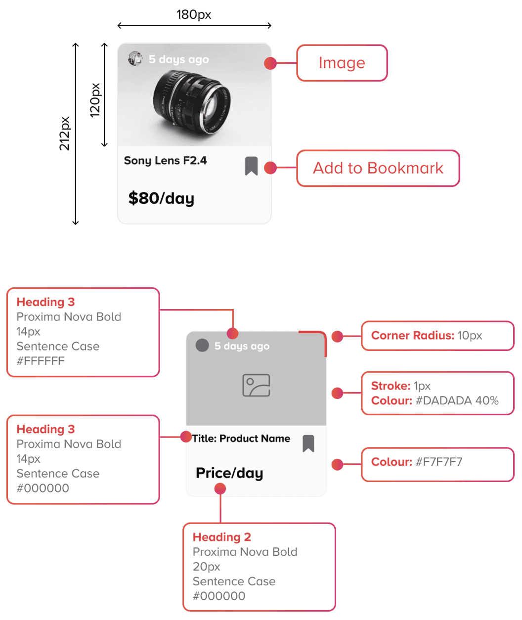
Primary Card - Horizontal
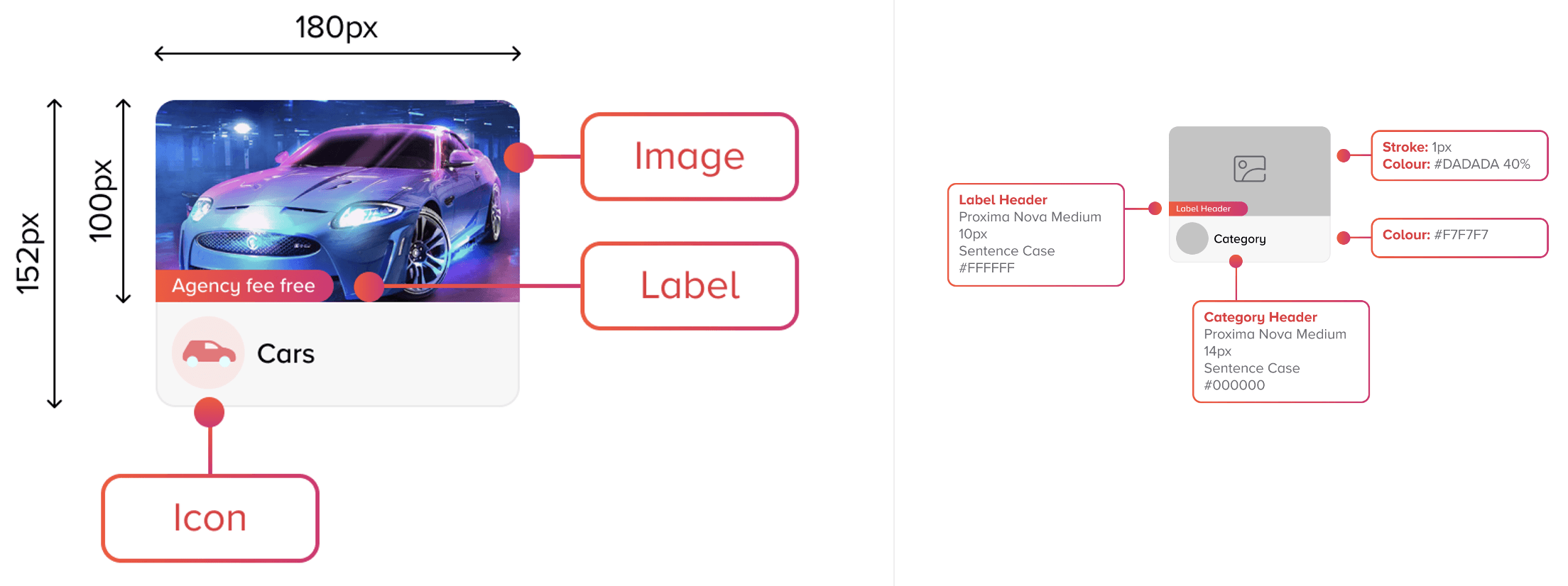
Secondary Card
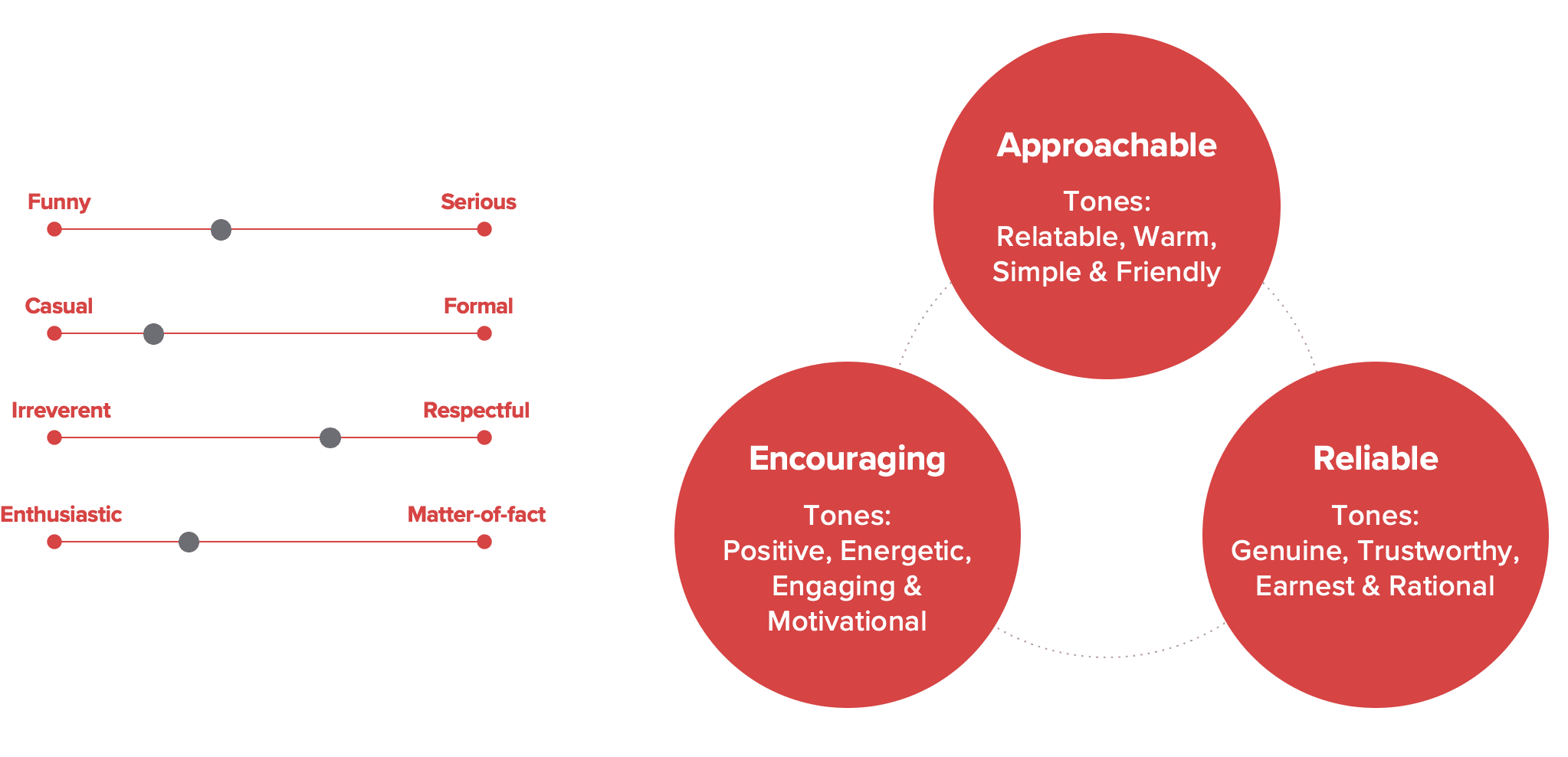
Tone of Voice
We need to consider the tone of voice, aiming for a balance of respect and informality. Our primary tones are Approachable, Encouraging, and Reliable.
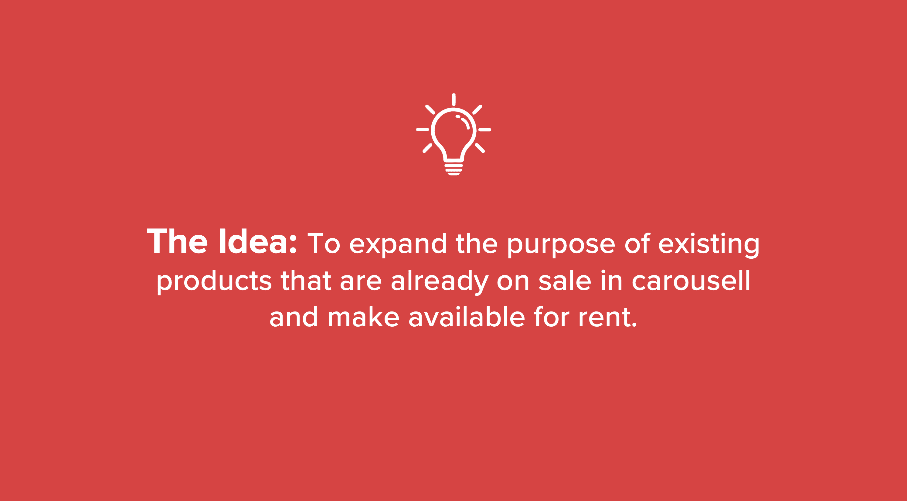
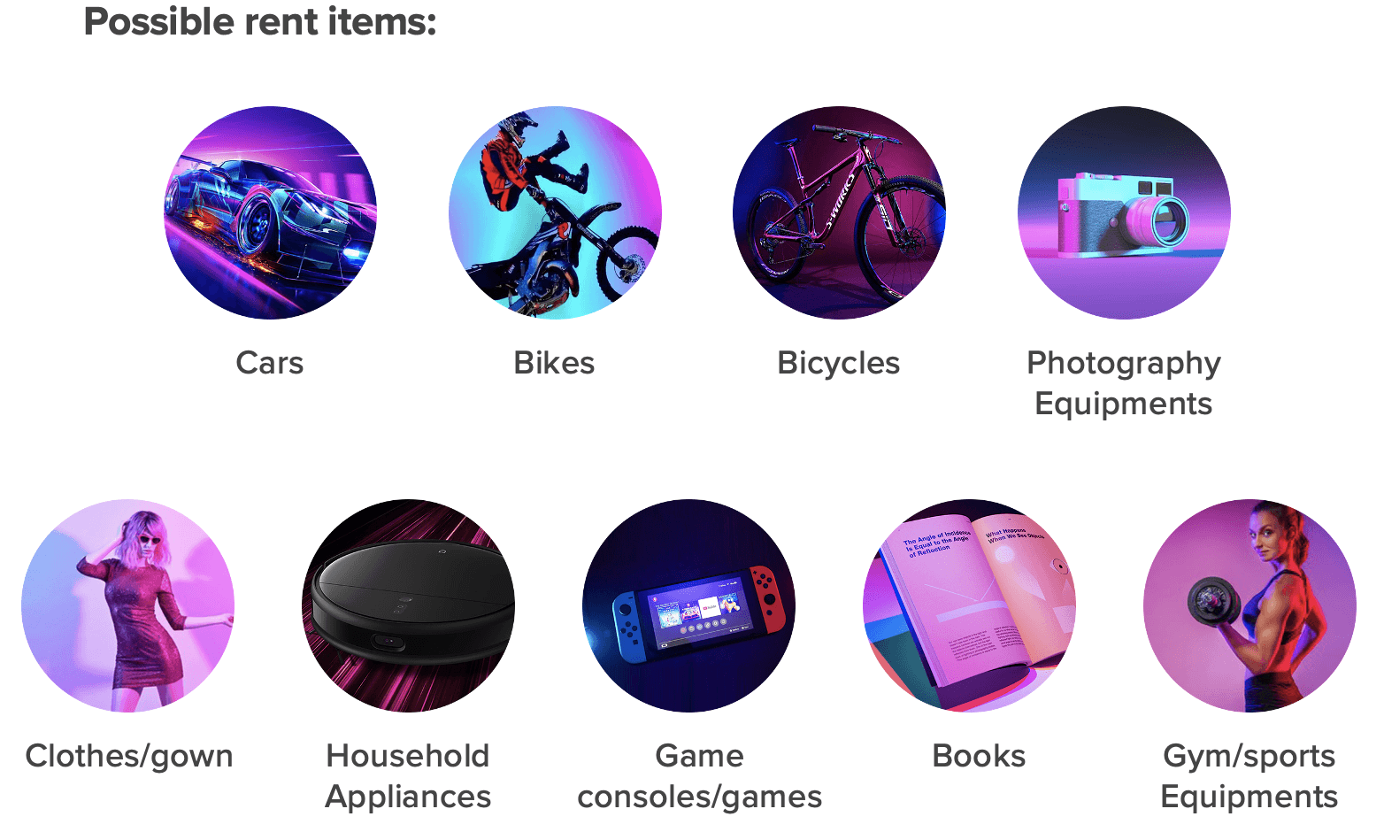
New Product Offering
CarouRent
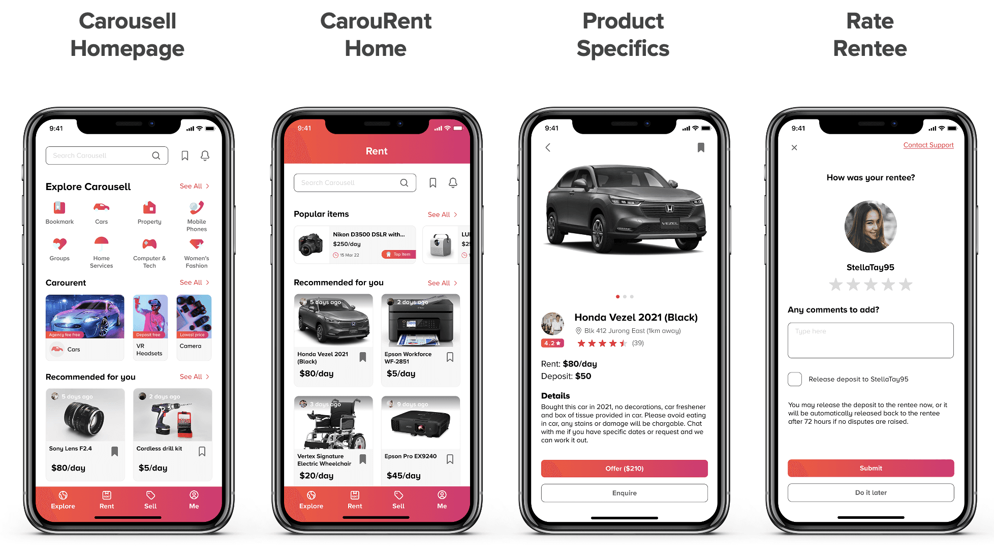
Application Of Design System
Prototype
This involves overhauling four screens, ensuring consistent application of the new design system.
Retrospective
Improvement for design system
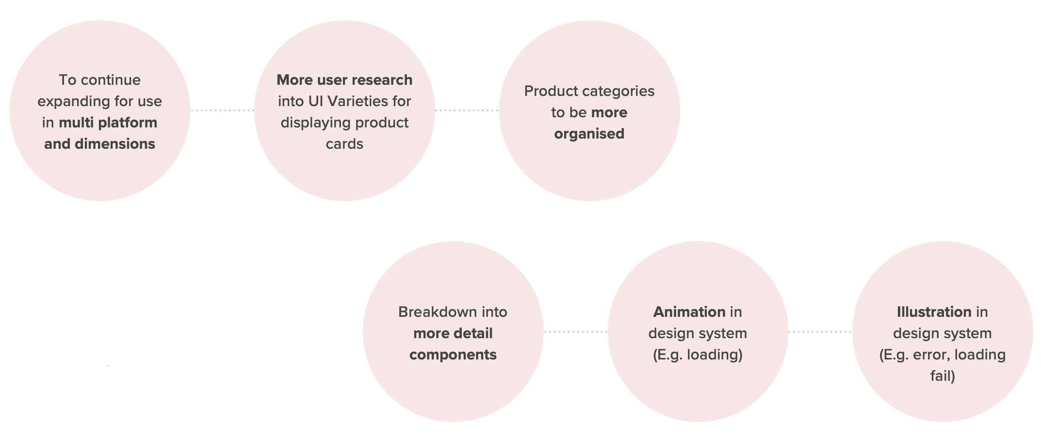
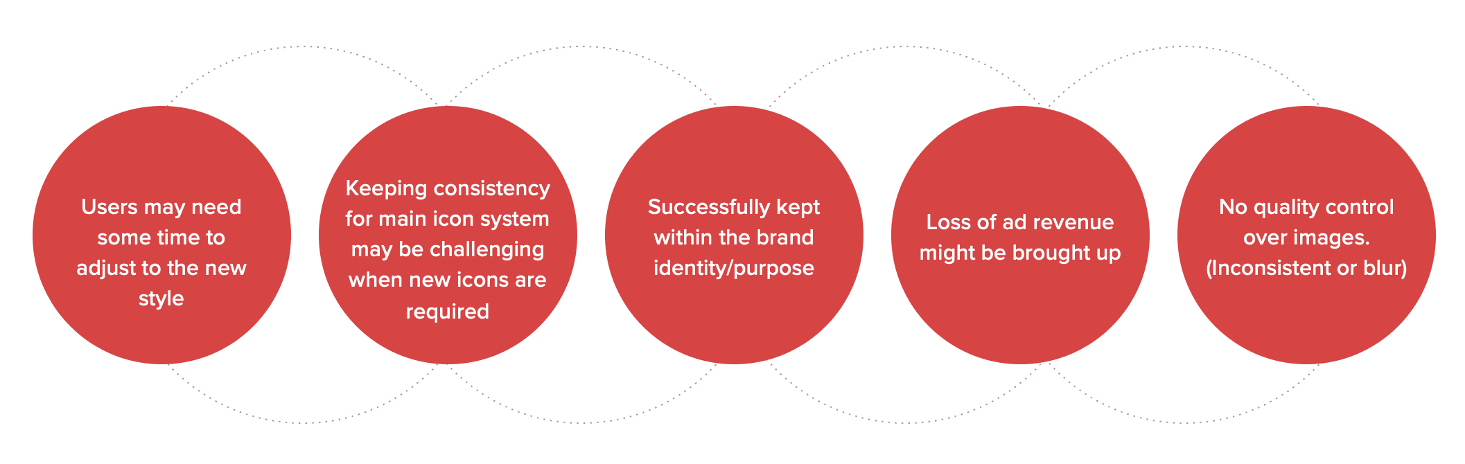
Constraints and retrospective

Copyright © Website design & Content by Chew Lijuan
Email: hellolijuan.c@gmail.com
Interested in working together? Drop me a line
Copy Email


Next Case Study
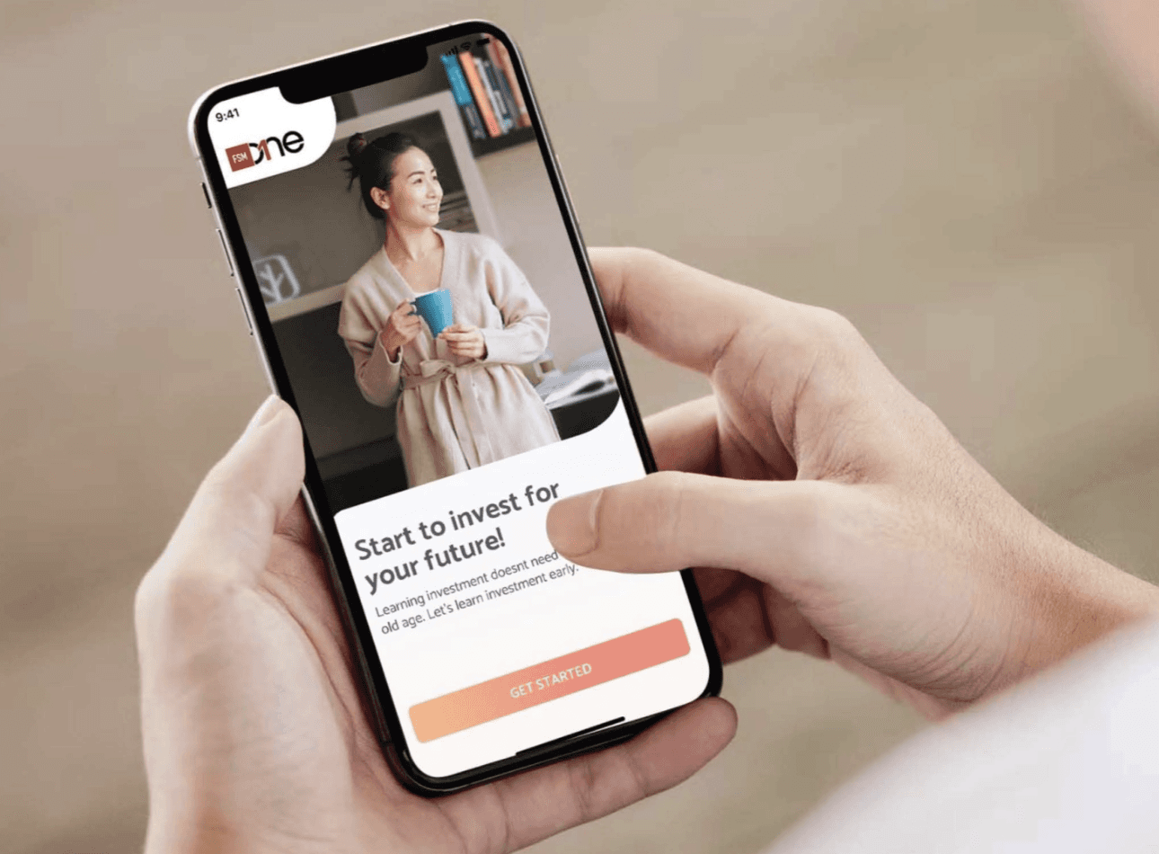

Lean UX case study on
FSMOne’s app redesign
Read Case Study